
When you hang out with knitters and crocheters and other varieties of yarn-obsessed people, you end up talking a lot out color. Me personally? I try to keep my mouth shut in those conversations and listen. As an eager and ambitious newbie designer of knit and crochet things I’m more interested in what other people like than spouting off about what I like. I try not to give color advice unless I’m specifically asked. Even then, I do my best to get a feel for what colors a person likes in the first place and just show them what they want to see. I mentally classify people as either a member of The Earthtone Coalition or as one of The Forces of Brightness (two terms shameless stolen from Neal Stephenson’s Reamde) and act accordingly.
It seems that every time you ask a color question, someone tells you to check a color wheel. That’s because the color wheel is an incredibly powerful tool. There is quite a lot of information packed into that thing and you can use it in a dozen different ways. The deeper you delve into color and that color wheel, the deeper you get into color theory.
I’m not going to get much into color theory here. There is no way I could do the subject justice. Color theory can be an semester-long college course, or an entire book. But I can talk about one small part of it: complementary colors and how to pick a set of complements that you like using a color wheel.
Btw, what I like is all. All colors appeal to me. They didn’t use to. When I was younger I was very much a black/white/red person who thought adding a touch of purple was very daring. But then one evening while camping in western New Mexico, I saw a sunset that changed the way I saw color forever. The sky did things I’d never seen before. All I can say is that it was amazing.
Let’s start with a very basic color wheel with six colors. You can think of these are three pairs: red/green, yellow/violet, and blue/orange.

They are called complements because they are on opposite sides of the wheel, because when you put these pairs together they energize and enrich each other. A red next to a green looks “more” red. Yellow will make violet look “more” violet. And so on.
These are the standard complementary colors and they appeal to very few people. Probably because they have been overused and we are kind of sick of looking at them. So lets try a wheel with more shades to pick from:

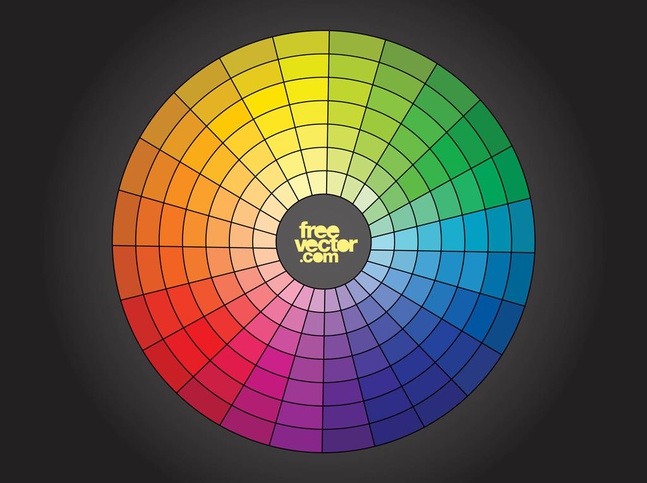
At this point, in my experience, The Forces of Brightness people can find a pair of complements that appeal to them. They may not go for the straight up yellow/violet combo, but the light green/magenta(ish) set could work for them. And they do work. Any two colors that sit across from each other on that wheel will energize each other and contrast nicely. So if this is starting to look like your kind of thing, here is one more wheel with many shades to pick from:

Go nuts!
But if you are a loyal member of The Earthtone Coalition, these wheels don’t work for you at all. That’s because all the colors on these wheels are at full saturation and you probably don’t care for that. You like colors that have been toned down or lightened up. Which is to say that you like colors that have been mixed with black or mixed with white.
So… while you may think yellow and violet together is obnoxious, you may have a competently different reaction to beige and lavender. Beige/tan/taupe and all the other light shades of brown are made by mixing yellow and black. Shades of lavender are made by mixing violet with white. Beige and lavender are complementary colors and they work.

For one more example let’s take the standard blue/orange combo. We can lighten up the blue with some white and make it a… sky blue. We can darken the orange with black and make it a brunt orange or even something approaching brick.

If that sort of combo appeals to you than this is the kind of color wheel you need (and I’m sorry but there is no other alternative than to toss you in at the deep end of this pool and make you swim);

Whether they are light or dark, as long as you pick colors from opposite sites of the color wheel, you have complements. They will contrast with each other. They will energize each other. Try the red violet #2 with the yellow green #8. Stick with the color wheel and you can’t go wrong.
And complementary colors are just one of the things a color wheel can give you. As I said above its a very powerful tool. My favorite book on color is Color Works by Deb Menz. Its detailed without being boring and all the examples are in knitting, spinning, weaving, beadwork, etc. Most color theory books are written for painters, but not this one. Its for crafters like us.

"There is no failure. Only feedback." - Robert Allen
10 Comments on "How to Use That Color Wheel"
I don’t usually talk color with my friends, because they all belong to the Earthtone Coalition, & I’m with the Forces of Brightness (LOVE those terms, btw). It usually takes people by surprise, because most of my work clothes are neutral. Because I like my accessories to REALLY pop!
Ah ha! You must be one of those people with a wardrobe that is all about setting off a super colorful shawl. I have a friend with twenty black dresses in her closet because she like to wear heels in outrageous colors.
What a briliant and simple idea. I never thought of using a color wheel for my yarn choices. I will try it now. I usually just “eyeball” it if it is for myself. I am mostly a Forces of Brightness as far as what I wear. Never choose colors for others without some kind of hint, suggestion or “what color do you want?” No surprise s from me. Thanks again for the great suggestion.
Happy to help! And yes, picking colors is hard enough. Picking them for other people? That’s almost impossible.
Color is so was when you are in your comfort zone. But, spread those wings and it becomes frightening! ?
It doesn’t have to be scary! Maybe you just need a color wheel and a little confidence in your own instincts. I’m sure you’ll be picking gorgeous colors in no time!
…but then I like everything.
Oh wow. wowoowowowow.
So I just finished one of my original designs in black and white and this is so on the mark for me. Yes, I agree completely. Black/white are the highest contrast. I guess that’s why I think if I knit up an original design in black and white it will really show it off. The (potential) buyer will be able to see exactly what the color work design is doing!
Thanks for the color wheel post! I’ll use it in combination with your other color posts~
You are very welcome! May the color wheel bring many yarn buying binges into your life.